|
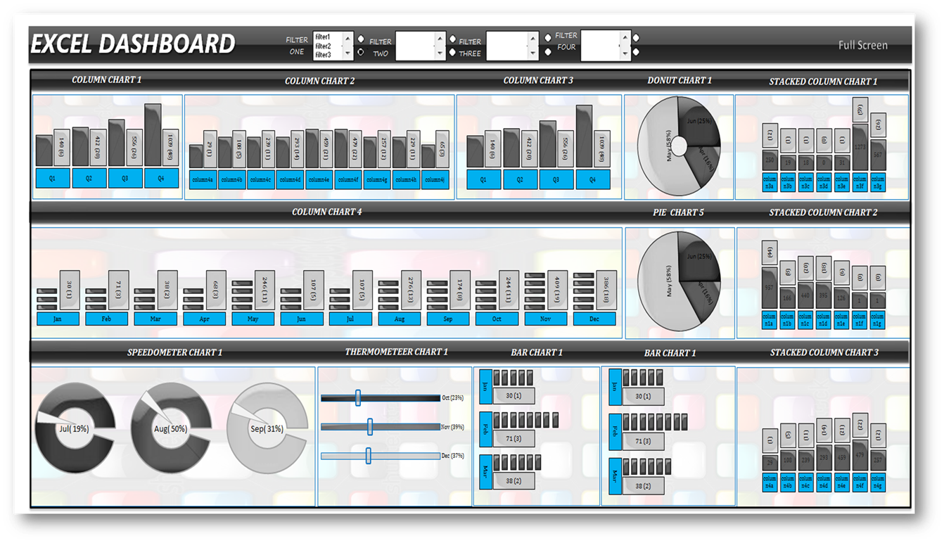
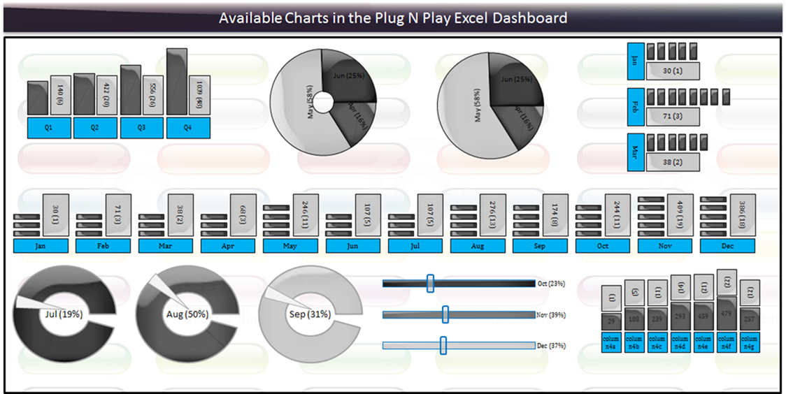
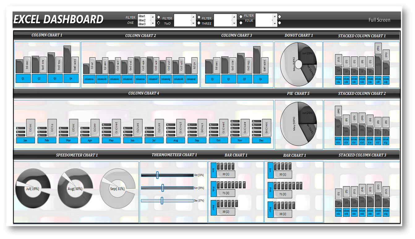
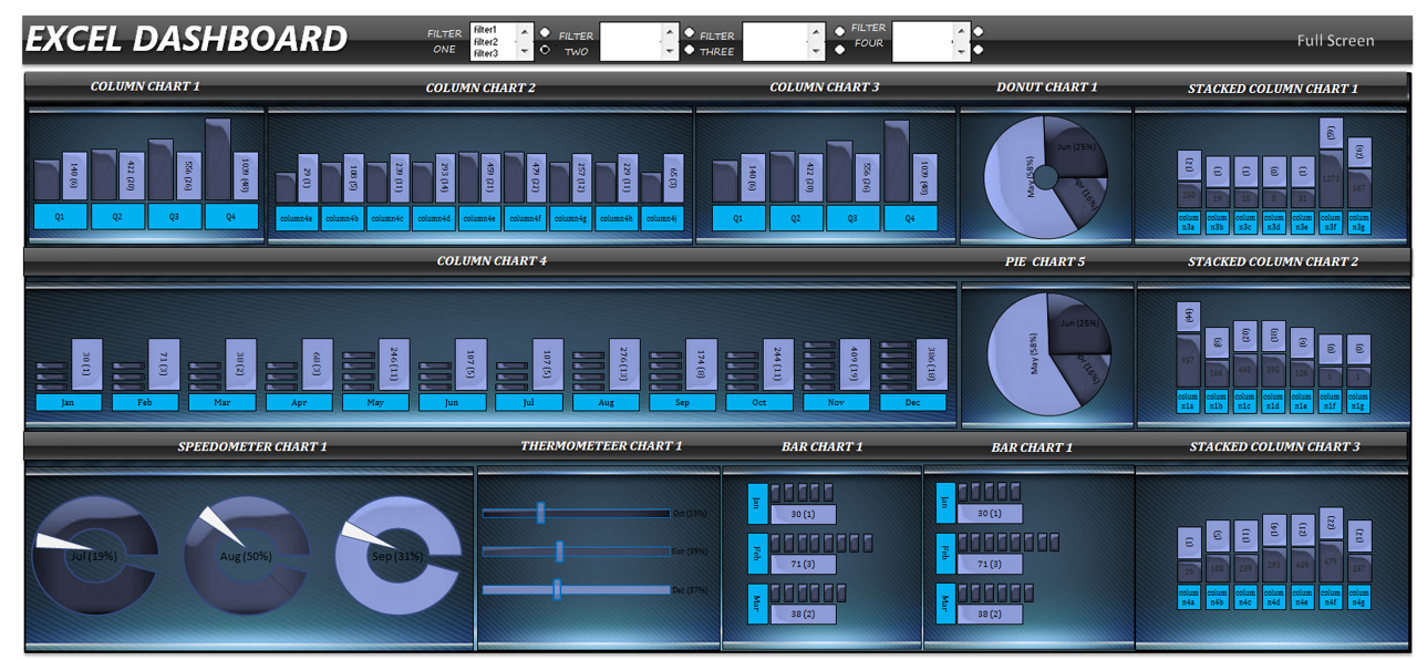
Excel Dashboard: |
|
|
|
|
|
|
|
|
|
|
|
|
|
|
|
|
|
for Educational purpose:- This Excel App can
be utilised to learn about different shapes that can be used for making
professional looking |
|
|
|
graphs
in Excel with the help of formulas, pivot tables and visual basic for
application |
|
|
|
|
|
|
|
|
|
|
|
|
|
|
|
|
|
|
|
|
|
|
|
|
|
|
|
|
|
for Programmers:- This concept is made
possible only with the help of visual basic for application as the shapes
have sized properly, |
|
|
|
|
positioned correctly, etc for the purpose of
building graphs |
|
|
|
|
|
|
|
|
|
|
|
|
|
|
|
|
|
|
|
|
|
|
|
|
|
|
|
|
|
|
|
for Corporates Employees:- This Excel App can
be used for business reporting purpose, for operational metrices like SLA,
TAT, Productivity, |
|
|
|
for analytical purpose, for use by Quality
Management team etc |
|
|
|
|
|
|
|
|
|
|
|
|
|
|
|
|
|
|
|
|
|
|
|
|
|
|
|
|
|
|
|
Moreover, this is a good startup product for
developing your skills in terms of preparing excel charts with Visual Basic
for Application |
|
|
|
Pre-Requisite: |
|
|
|
|
|
|
|
|
|
|
|
|
|
|
|
|
|
Things that you require before you start
working on your custom dashboard are mentioned below |
|
|
|
|
|
|
|
|
|
|
|
|
|
|
|
|
|
|
|
|
|
|
|
|
|
|
|
Firstly you will need properly filled data
table with several columns (atleast data with 10 categories, 4 categories for
filtering) to completely |
|
|
|
populate the dashboard. If there are less
number of data, the dashboard would look empty. Data can be of any kind, for
example operations |
|
|
|
data like turn around time (TAT),
productivity, service level agreement (SLA) and accuracy. can be human
resource data, business analysis |
|
|
|
data or statistical data |
|
|
|
|
|
|
|
|
|
|
|
|
|
|
|
|
|
|
|
|
|
|
|
|
|
|
|
|
|
|
|
|
|
|
|
Remember that this charting software is only
for calculated datasets, i.e. data values should be calculated already like
sum, count, |
|
|
|
|
sumproduct, average, median, mean and mode.
This charting software will only dispaly the chart with the corresponding
data values. These |
|
|
|
types of dashboard can be used for
presentations, slide shows etc. |
|
|
|
|
|
|
|
|
|
|
|
|
|
|
|
|
|
|
|
|
|
|
|
|
|
|
|
|
|
|
After your data is ready, the data has to be
pasted in the data sheet of this dashboard. post that you have to analyse
which type of chart |
|
|
|
|
is suitable for each dataset |
|
Step by Step Instructions to create Excel
Dashboard (One-time Setup) |
|
|
|
|
|
|
|
|
|
|
1) activate 'charts' worksheet in this workbook |
|
|
|
|
|
|
|
|
|
|
|
|
|
2) enter datapoints
in your chart named range in column 'F".
for example, if your chart named range has 5 entries, enter 5 in column 'F' |
|
|
|
3) create chart range
in the 'reports' worksheet. for example, if
your chart range has 5 datapoints and if the chart range starts from A2, |
|
|
|
then create namedrange from A2 to A6 and name
the named range. enter the named range in column 'H' of the 'charts'
worksheet |
|
|
|
|
4) select add from
the column named 'charts' to add charts to
the corresponding templates |
|
|
|
|
|
|
|
|
|
5) click on 'Generate
Charts' and your chart template is ready for
use |
|
|
|
|
|
|
|
|
|
|
|
6) you will find the
template you have just created in the template worksheets (there are 9 template worksheets named from 'template1' |
|
|
|
to 'template9') |
|
|
|
|
|
|
|
|
|
|
|
|
|
|
|
|
|
7) cut & paste
the chart templates to the 'dashboard' worksheet. the chart templates are named appropriately, however
make sure |
|
|
|
|
there are no duplicate chart names in your
chart template collections |
|
|
|
|
|
|
|
|
|
|
|
8) now register the
chart templates in the 'settings' tab (shown
below) |
|
|
|
|
|
|
|
|
|
|
|
|
|
|
|
|
|
|
|
|
|
|
|
|
|
|
|
|
|
|
|
|
|
|
|
|
|
|
|
|
|
|
|
|
|
|
|
|
|
|
|
|
|
|
|
|
|
|
|
|
|
|
|
|
|
|
|
|
|
|
|
|
|
|
|
|
|
|
|
|
|
|
|
|
|
|
|
|
|
|
|
|
|
|
|
|
|
|
|
|
|
|
|
|
|
|
|
|
|
|
|
|
|
|
|
|
|
|
|
|
|
|
|
|
|
|
|
|
|
|
|
|
|
|
|
|
|
|
|
|
|
|
|
|
|
|
|
|
|
|
|
|
|
|
|
|
|
|
|
|
|
|
|
|
|
|
|
|
|
|
|
|
|
|
|
|
|
|
|
|
|
|
|
|
|
|
|
|
|
|
|
|
|
|
|
|
|
|
|
|
|
|
|
|
|
|
|
|
|
|
|
|
|
|
|
|
|
|
|
|
|
|
|
|
|
|
|
|
|
|
|
|
|
|
|
|
|
|
|
|
|
|
|
|
|
|
|
|
|
|
|
|
|
|
|
|
|
|
|
|
|
|
|
|
|
|
|
|
|
|
|
|
|
|
|
|
|
8a) the table starts from column 'N' and ends
in column 'W' and is coloured in yellow |
|
|
|
|
|
|
|
|
|
|
8b) populate the settings column completely for
proper functioning of the charts |
|
|
|
|
|
|
|
|
|
|
8c) refer to the table below for entries in the
settings tab corresponding to template names |
|
|
|
|
|
|
|
|
|
|
Bar |
range09vc |
dashboard |
3 |
Chart_Bar |
_stick_bar |
_stick_text |
_stick_value |
0_Chart_Bar |
n/a |
template1 |
|
|
|
|
|
|
|
|
Column 1 |
range07v |
dashboard |
12 |
Chart_Column1 |
_stick_bar |
_stick_text |
_stick_value |
0_Chart_Column1 |
n/a |
template2 |
|
|
|
|
|
|
|
|
Donut |
range09vd |
dashboard |
3 |
Chart_Donut |
_Donut_chart |
n/a |
n/a |
0_Chart_Donut |
n/a |
template3 |
|
|
|
|
|
|
|
|
TherMo |
range09vf |
dashboard |
3 |
TherMo_chart_group |
TM_bar |
n/a |
n/a |
0_TherMo_chart_group |
n/a |
template4 |
|
|
|
|
|
|
|
|
Pie |
range09vd |
dashboard |
3 |
Chart_Pie |
_Pie_chart |
n/a |
n/a |
0_Chart_Pie |
n/a |
template5 |
|
|
|
|
|
|
|
|
SpeedO |
range09ve |
dashboard |
3 |
speedo_chart_group |
_Speedo_chart_ |
n/a |
n/a |
0_speedo_chart_group |
n/a |
template6 |
|
|
|
|
|
|
|
|
Column 2 |
range06v |
dashboard |
4 |
Chart_Column2 |
_stick_bar |
_stick_text |
_stick_value |
1_Chart_Column2 |
n/a |
template7 |
|
|
|
|
|
|
|
|
Stack |
range03v |
dashboard |
7 |
Chart_Stack |
_stick_bar |
_stick_text |
_stick_value |
0_Chart_Stack |
n/a |
template9 |
|
|
|
|
|
|
|
|
|
|
|
|
|
|
|
|
|
|
|
|
|
|
|
|
|
|
|
9) dashboard has four levels of data drill-down
(filtering) from macro level to micro level |
|
|
|
|
|
|
|
|
|
|
|
|
|
|
|
|
|
|
|
|
|
|
|
|
|
|
|
|
|
10) your dashboard is ready for use |
|
|
|
|
|
|
|
|
|
|
|
|
|
|
|
|
|
|
|